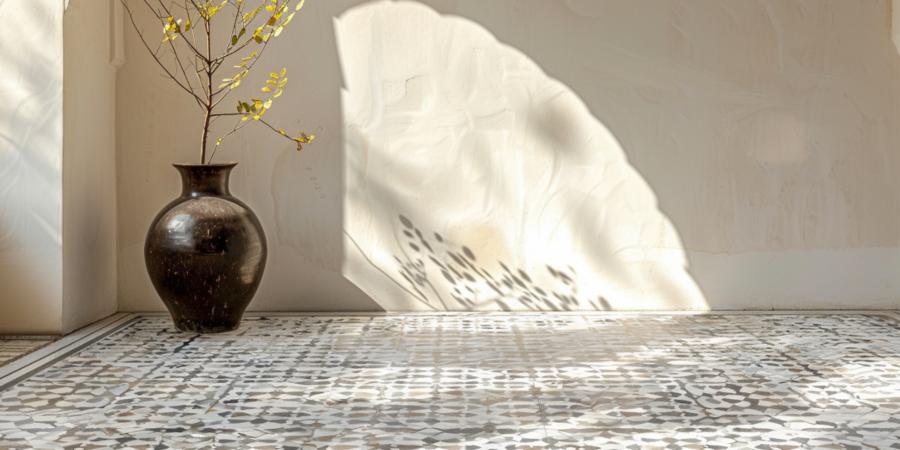
Why Your Floor is Messing With Your Head (And What to Do About It)
 It starts innocently. You're standing in a tile showroom, squinting at a wall of porcelain rectangles and thinking, "How hard can it be?" An hour later, you're muttering something about "chevron versus herringbone" while Googling whether your sanity is refundable. Turns out, tile layout isn't just about aesthetics or resale value — it's about psychology. The way tiles are arranged can subtly manipulate how we perceive space, mood, and flow. It's architectural gaslighting, and we're all victims. Let's break it down pattern by pattern.
Herringbone: The Confident Chaos
Herringbone is what happens when zigzags grow up and get a degree in interior design. It's dynamic, energetic, and just the right amount of chaotic. Visually, it creates movement — a sort of momentum across the floor or wall — which tricks the eye into thinking the room is longer or taller than it really is.Spatial psychologists (yes, that's a real thing) suggest that patterns with implied directionality can create the illusion of expansion. That means herringbone laid vertically can make a bathroom ceiling feel higher, while a horizontal layout can stretch a hallway in your mind's eye.
It's not subtle, and it's not shy. But that's the point. Herringbone makes a space feel intentional, and its busy rhythm can add character to rooms that might otherwise feel flat. Think of it as architectural espresso — not for the faint of heart, but definitely wakes up the place.
Diagonal Layouts: The Sneaky Space Hack
People love right angles. Builders adore them. But your subconscious? It's a rebel. Diagonal tile layouts push against that love of 90-degree predictability and end up feeling... spacious. That's because diagonal patterns blur the lines of where walls begin and end, creating visual ambiguity that opens up the room.This is particularly useful in smaller spaces — powder rooms, galley kitchens, any room where the word "cozy" is actually a warning. The diagonal pulls the eye across corners, expanding perceived space without moving a single wall. It's basically visual fraud, and it works brilliantly.
However, there's a dark side. Cutting tiles on a diagonal can be time-consuming and wasteful. And don't even think about doing it without a tile saw and a temper-proof mood. You'll end up with a lot of broken porcelain and a philosophical crisis about whether square tiles were ever meant to be laid this way.
Stacked Bond: Order, Calm, and Mild Emotional Numbness
The stacked pattern — tiles aligned neatly on top of one another like bricks that never took a risk — is simplicity itself. It evokes calm, precision, and depending on the room, the interior design equivalent of a tax return: functional, reliable, and maybe a bit emotionally distant.This layout doesn't create movement or trick the eye, but that's actually its strength. Stacked bond is about predictability and minimalism. It's often used in modern bathrooms or kitchens where clean lines are king and serenity is the end goal. When done right, it can feel like meditating with your eyeballs.
But if overused, it can come off cold — like the kind of space where someone would silently judge your mug collection. To soften the effect, designers often recommend using warm-toned tiles or pairing stacked layouts with organic textures like wood or linen. Or, if all else fails, get a dog. Dogs soften everything.
Running Bond: Familiar, Friendly, and Just a Bit Tipsy
Running bond, also called subway tile layout, is the crowd-pleaser of the tiling world. Tiles are staggered so each one overlaps the seams of the row below. It's familiar, balanced, and a little playful — kind of like your friend who wears colorful socks under a gray suit.This pattern softens geometry. The horizontal stagger breaks up the rigid order of rows, making it easier on the eye and more forgiving in uneven rooms. It's a great choice when you want a classic look without the formal stiffness of stacked layouts.
Psychologically, running bond brings a sense of comfort and continuity. There's something reassuring about repetition with a twist. It also does a sneaky trick: because your eye follows the staggered lines, it distracts from minor flaws in alignment or leveling. Perfect for those who enjoy DIY but have a slightly loose relationship with the concept of "straight."
Basketweave and Modular Patterns: For the Architecturally Adventurous
Now we're getting weird — in a good way. Basketweave and modular layouts aren't about subtlety. They're about flair. These patterns create visual interest through complexity, and used strategically, they can add texture to a space without changing materials.Basketweave creates interlocking illusions, often used in traditional homes or in contrast with modern finishes for an unexpected blend. Modular patterns mix tile sizes within a grid, introducing rhythm and variety that can make a floor feel custom-built, even when it's made from off-the-shelf porcelain.
But beware: these patterns demand precision. Bad grout lines or misaligned segments will ruin the effect and make the room feel like it's slightly vibrating. If you're not hiring a professional, at least bribe someone with a good eye and a healthy respect for symmetry.
Mind Over Mortar
Tiling isn't just technical — it's psychological warfare against your own perception. The layout you choose has as much power over a room as the tile itself. It can stretch walls, raise ceilings, calm nerves, or make your bathroom look like it belongs to a Bond villain (if you go full black herringbone, which — no judgment).So next time you're standing in a tile aisle wondering whether "chevron" is just herringbone's dramatic cousin, remember: you're not just choosing a pattern. You're choosing how a space will feel, move, and behave. Layout isn't just design — it's manipulation, and done right, it's a beautiful kind.
Article kindly provided by qlhtiling.com.au
Latest Articles
- Why Some Roof Leaks Only Appear During Wind-Driven Rain
- Why the Most Memorable Rooms Usually Have One Thing That Feels Unexpected
- Case Study - How Much Does a New Roof Cost in Harrogate?
- Case Study - How Much Does Block Paving Cost in Derby?
- Solar Power: What Happens to Your Energy After Sunset?
- Why Your Windows Could Be Costing You More Than Your Boiler
- Choosing the Right Bit for Wood, Metal, Masonry and More
- Outdoor Furniture Survival Rules for Tropical Weather
- The Psychology of Home Heating: Why Some Houses Always Feel Cold
- Why Kitchen Cabinets Fail Long Before They Should
- Why Your Front Door Suddenly Becomes Hard to Lock
- The Psychology of Letting Go: Why It's So Hard to Clear Out a Home
- From Flat to Dimensional: Creating Depth in Residential Interior Photography
- Why Most Homes Are Over Lit - and How to Fix It Without Spending More
- Why Small Tree Problems Escalate Faster Than You Think
- How Light Changes Your Floor: Why the Same Wood Looks Completely Different in Every Room
- How to Choose a Lawn Care and Landscaping Company
- Why Sliding Doors Change How You Use a Room: Rethinking Bedroom Layouts
- Why Your Outdoor Surface Choice Matters More Than Your Furniture
- The Hidden Trade-Off Between Comfort and Grip in Outdoor Flooring
- Interior Design
- Home Improvement
- Gardening
- Home Organization
- Home Maintenance
- DIY Crafts
- Kitchen and Dining
- Bathroom Design
- Home Security
- Home Automation
- Green Living
- Home Office
- Home Decor
- Garden Design
- Pet Care
- Home Technology
- Landscaping
- Home Energy Efficiency
- Home Cleaning
- Home Safety
- Home Exterior
- Home Insulation
- Home Buying
- Home Selling
- Renting
- Tradespeople
- Garage
- Bedroom
- Painting and Decorating
- Plumbing and Drainage