Color Psychology for Forgotten Corners That Need a Vibe Check
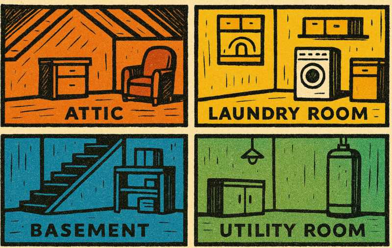 Some rooms were clearly designed with love. Others were thrown together like a last-minute costume — barely functional, rarely seen, and entirely joyless. The attic, the laundry room, that basement that feels like a hostage situation — they've all suffered in silence under fluorescent tubes and "builder's beige." It's time for redemption.
Color isn't just decoration. It's atmosphere. It's attitude. And it can transform these awkward, unloved zones into something better than just "not depressing."
The Attic Isn't Haunted, It's Just Grey
Most attics are trapped in that weird design purgatory where "unfinished" is considered a valid aesthetic. You go up there for a box of old Halloween decorations and leave convinced someone was watching you. That's not paranormal — it's just the color scheme whispering "abandon hope."Now imagine painting the walls a warm ochre or a soft blush. Suddenly, you're not in a drafty echo chamber — you're in a cozy reading nook or a moody artist's studio. Deep greens can lend a library-like calm. Pale lilac can give it a touch of whimsical serenity. Even a matte navy can work if you're channeling "mysterious recluse" instead of "crime scene."
And yes, insulation and flooring help too, but let's not pretend color isn't the cheapest magic trick available.
Laundry Rooms Deserve Better Than Dishwasher White
If your laundry room is the visual equivalent of elevator music, no wonder you hate doing laundry. Staring at four blank white walls while socks vanish into the void is a slow spiritual collapse.Injecting color — real color — turns drudgery into ritual. Try something citrusy, like a zingy lime or cheerful tangerine, and see how the whole space wakes up. Even powder blue can make the room feel cleaner, which is good, because laundry rooms often smell like mildew and denial.
For smaller spaces, stick with light-reflective shades, but don't default to white. Off-whites with undertones (peach, mint, buttery cream) still bounce light around but don't feel like a hospital corridor. Add a patterned floor or painted cabinets, and suddenly laundry is less of a punishment.
Basements: Dungeon or Den?
There's a fine line between "cozy basement hangout" and "set of a low-budget thriller." The lighting is usually to blame, but the wrong paint color can double down on the discomfort.Avoid the urge to paint everything beige to "brighten it up." Beige doesn't brighten — it blends into the concrete like a nervous ghost. Try warm terracotta, earthy olive, or soft teal. These colors bring in the sense of groundedness and make a space without natural light feel less like you've been buried alive.
Want a workspace down there? Go for a deep charcoal accent wall to add a bit of edge, paired with warm wood tones. Want a game room? Bring in bold primary colors in small doses — too much and it'll look like a daycare with plumbing issues.
Basements are a chance to play with moodier palettes. You're underground anyway — why pretend it's a beach house?
Utility Rooms Shouldn't Feel Like Punishment
You know the one — that sad little room where the boiler lives, the one with a bare bulb dangling like it's in a police interrogation scene. These utility spaces are usually afterthoughts, designed to store tools, wires, and forgotten responsibilities.But here's the thing: you go in there. You see it. You use it. And every time you do, it punches you in the morale. So why not soften the blow?
Try slate blue or sage green — calm, no-nonsense colors that say, "Yes, I'm a space for function, but I've got standards." A pop of color on the door or even a bold checkerboard floor pattern can inject a surprising amount of charm without compromising utility. Just because a room's job is dull doesn't mean its personality has to be.
Psychology, But Make It Practical
Color psychology isn't just something marketing people use to sell snacks. It's backed by behavioral studies, emotional responses, and an unsettling number of Pinterest boards.Here's a quick cheat sheet for commonly overlooked spaces:
- Yellow: Energizing and uplifting. Good for windowless zones like basements or laundry rooms where morale is at risk.
- Green: Balances and soothes. Great for transitional spaces like mudrooms or attics converted into quiet retreats.
- Blue: Cool and calming. Use in utility rooms or small corners that need a sense of order.
- Terracotta/Clay: Grounding and warm. Excellent in basements or storage-heavy spaces where coziness is key.
- Pale pinks and purples: Create a soft, unexpected elegance in spaces you want to transform from "meh" to mildly magical.
Final Brushstroke: Hue Kidding?
Ignoring these underloved rooms is easy — no one gives a house tour and says, "And this, *this* is the boiler room where I feel most alive." But think about how much better your daily routine could feel if even these corners had a little soul. A little personality. A little less "why is this light flickering ominously."Intentional color choice can shift how you interact with your space. It can make the attic feel like a bonus room, not a spider summit. It can turn laundry into less of a tragic task and more of a moment of "yeah, this room slaps."
Paint is affordable. Color is powerful. And those weird little rooms? They've waited long enough.
Article kindly provided by orchiddecor.co.uk
Latest Articles
- Choosing the Right Bit for Wood, Metal, Masonry and More
- Outdoor Furniture Survival Rules for Tropical Weather
- The Psychology of Home Heating: Why Some Houses Always Feel Cold
- Why Kitchen Cabinets Fail Long Before They Should
- Why Your Front Door Suddenly Becomes Hard to Lock
- The Psychology of Letting Go: Why It's So Hard to Clear Out a Home
- From Flat to Dimensional: Creating Depth in Residential Interior Photography
- Why Most Homes Are Over Lit - and How to Fix It Without Spending More
- Why Small Tree Problems Escalate Faster Than You Think
- How Light Changes Your Floor: Why the Same Wood Looks Completely Different in Every Room
- How to Choose a Lawn Care and Landscaping Company
- Why Sliding Doors Change How You Use a Room: Rethinking Bedroom Layouts
- Why Your Outdoor Surface Choice Matters More Than Your Furniture
- The Hidden Trade-Off Between Comfort and Grip in Outdoor Flooring
- Designing a Garden Renovation Without the Chaos
- What Your Building Is Doing Wrong With Electricity (Even If Everything Seems Fine)
- The Hidden Relationship Between Gutters and Structural Damage
- The Hidden Math Behind Healthy Lawns Getting Seed Soil and Coverage Right
- The Hidden Enemy of Exterior Walls: How Modern Renders Prevent Algae and Green Staining
- What the First Hour in a New Home Reveals About How People Actually Live
- Interior Design
- Home Improvement
- Gardening
- Home Organization
- Home Maintenance
- DIY Crafts
- Kitchen and Dining
- Bathroom Design
- Home Security
- Home Automation
- Green Living
- Home Office
- Home Decor
- Garden Design
- Pet Care
- Home Technology
- Landscaping
- Home Energy Efficiency
- Home Cleaning
- Home Safety
- Home Exterior
- Home Insulation
- Home Buying
- Home Selling
- Renting
- Tradespeople
- Garage
- Bedroom
- Painting and Decorating
- Plumbing and Drainage