Strategic Wall Art Placement: Mood, Creativity, and Why Your Wall Deserves Better
The Eye-Level Conspiracy
When it comes to wall art, there's one cardinal rule that separates the inspired from the chaotic: keep it at eye level. But whose eye level, you ask? Great question. For adults, the golden height is typically around 57 to 60 inches from the floor to the center of the piece. This ensures the art is both accessible and aesthetically pleasing. Unless you're decorating for a basketball team or a group of toddlers, consistency is key.Why does eye level matter? Because it's where our eyes naturally rest, making it a prime spot for setting the tone of a room. A soothing landscape at eye level in the living room can evoke calm and relaxation. On the other hand, hanging a vibrant abstract piece at the same height in your office might inspire bursts of creativity. Hang it too high, and you risk turning it into ceiling art—impressive only to the light fixtures.Symmetry: Your Brain Craves Balance
Our brains are hardwired to appreciate symmetry. It's why we find beauty in evenly spaced frames, aligned edges, and neatly balanced compositions. When you hang art asymmetrically or at random angles, it can create a sense of unease—perfect if you want your guests to feel slightly disoriented but less ideal for productivity or relaxation.For a harmonious space, group smaller pieces together with equal spacing between them or center a single large piece above a focal point like a sofa or desk. Symmetry not only pleases the eye but also helps create order, which is great news for those of us who need a little mental clarity in our chaotic lives. It's art placement feng shui without the extra candles and crystals.
Color Psychology: The Silent Mood Booster
Ah, color—the unsung hero of wall art placement. The hues in your chosen pieces can directly impact the mood of a room. Blue tones promote calm and focus, making them ideal for a home office or study. Yellow adds energy and optimism, which works wonders in kitchens or creative spaces. Red? Passion and intensity, though you might want to steer clear unless you're running a high-stakes law firm—or a steakhouse.The key is balance. Too much of one color can overwhelm the senses, turning what should be a mood booster into a sensory overload. Use complementary colors to create contrast, and pair bold art with neutral furniture to let the piece shine without overpowering the room. It's like a dinner party: the art is the star, but the walls are the gracious host.
Room-Specific Strategies: One Size Does Not Fit All
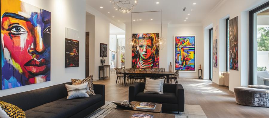
Every room has its own vibe, and your wall art should play along like a well-rehearsed supporting actor. In the bedroom, the goal is tranquility. Soft landscapes, abstract patterns in muted tones, or even black-and-white photography can create a serene atmosphere that whispers, "Relax, you've earned this." Just avoid anything too stimulating—no one needs a neon jungle scene glaring at them when they're trying to sleep.In the living room, on the other hand, you can afford to be a bit bolder. This is where statement pieces thrive. Consider a large canvas as a focal point or create a gallery wall with a mix of styles and frames to showcase your personality. Remember, the living room is your stage to impress guests, so lean into art that sparks conversation. But, maybe not *too* much conversation—skip the avant-garde pieces that require a 20-minute backstory.
The Office: Where Creativity and Focus Meet
The office is a tricky beast. You want art that inspires without distracting. Motivational quotes? Sure, but skip the overused "Live, Laugh, Love" trifecta unless you want your coworkers rolling their eyes every time they walk in. Instead, opt for abstract pieces with bold colors to ignite creativity, or minimalist designs in blues and greens to keep you calm and focused.And don't forget the placement! Art hung behind your desk is perfect for Zoom calls—who doesn't want to look effortlessly cultured? Just make sure it's nothing too wild; you're here to impress your colleagues, not leave them wondering if you moonlight as an art critic.
Small Spaces, Big Impact
Tiny rooms often get overlooked in the art placement department, but they deserve love too. In bathrooms, a small, playful print can add character without overwhelming the space. In hallways, a series of smaller frames arranged in a straight line can guide the eye and make the area feel more expansive. Even a well-placed piece above a coat rack in an entryway can set the tone for your home.Small spaces are also great for experimenting. Have a quirky piece you're not quite ready to debut in the living room? Test it out in a corner of your bedroom or above a bookshelf. Worst-case scenario, you've just given your houseplants something to gossip about.
Hanging by a Thread: Avoiding the Common Pitfalls
Let's address the elephant in the room: bad art placement. Hanging your art too high is a classic rookie mistake—unless you're creating a gallery for giraffes. Likewise, crowding multiple pieces together without spacing can make even the most beautiful art look like a thrift store clearance section.Invest in proper hardware and tools, like a level and sturdy hooks. No one wants their art taking an unplanned nosedive during dinner. And always step back to assess your work. Sometimes what looks balanced up close turns into a Picasso-inspired mess from across the room.
Wall Art: It's Hanging Out
Wall art isn't just decoration; it's a tool for shaping emotions, sparking creativity, and setting the tone of your spaces. Whether it's the soothing blues in your home office, the striking centerpiece in your living room, or the cheeky print brightening up a small bathroom, thoughtful placement makes all the difference.So, grab that hammer (and maybe a level), and let your walls do the talking. Just remember: they're saying something about you, so make sure it's something good. Nobody wants their walls whispering, "This guy hung me crooked."
Article kindly provided by veranito.co.uk
Latest Articles
- Choosing the Right Bit for Wood, Metal, Masonry and More
- Outdoor Furniture Survival Rules for Tropical Weather
- The Psychology of Home Heating: Why Some Houses Always Feel Cold
- Why Kitchen Cabinets Fail Long Before They Should
- Why Your Front Door Suddenly Becomes Hard to Lock
- The Psychology of Letting Go: Why It's So Hard to Clear Out a Home
- From Flat to Dimensional: Creating Depth in Residential Interior Photography
- Why Most Homes Are Over Lit - and How to Fix It Without Spending More
- Why Small Tree Problems Escalate Faster Than You Think
- How Light Changes Your Floor: Why the Same Wood Looks Completely Different in Every Room
- How to Choose a Lawn Care and Landscaping Company
- Why Sliding Doors Change How You Use a Room: Rethinking Bedroom Layouts
- Why Your Outdoor Surface Choice Matters More Than Your Furniture
- The Hidden Trade-Off Between Comfort and Grip in Outdoor Flooring
- Designing a Garden Renovation Without the Chaos
- What Your Building Is Doing Wrong With Electricity (Even If Everything Seems Fine)
- The Hidden Relationship Between Gutters and Structural Damage
- The Hidden Math Behind Healthy Lawns Getting Seed Soil and Coverage Right
- The Hidden Enemy of Exterior Walls: How Modern Renders Prevent Algae and Green Staining
- What the First Hour in a New Home Reveals About How People Actually Live
- Interior Design
- Home Improvement
- Gardening
- Home Organization
- Home Maintenance
- DIY Crafts
- Kitchen and Dining
- Bathroom Design
- Home Security
- Home Automation
- Green Living
- Home Office
- Home Decor
- Garden Design
- Pet Care
- Home Technology
- Landscaping
- Home Energy Efficiency
- Home Cleaning
- Home Safety
- Home Exterior
- Home Insulation
- Home Buying
- Home Selling
- Renting
- Tradespeople
- Garage
- Bedroom
- Painting and Decorating
- Plumbing and Drainage