From Flat to Dimensional: Creating Depth in Residential Interior Photography
 A room can look perfectly fine to the human eye and still fall completely flat in a photograph, like a pancake that forgot its purpose. The difference comes down to depth—how the viewer's eye moves through the image, how layers are revealed, and how space feels inhabited rather than staged. Residential interiors, especially everyday living spaces like lounges, kitchens, and bedrooms, offer plenty of built-in tools for creating this sense of dimension. The trick is learning to see them not just as rooms, but as visual pathways.
Seeing in Layers Instead of Surfaces
Most beginner shots treat a room like a postcard: everything visible, everything evenly spaced, nothing particularly interesting happening. Depth begins when you stop trying to show everything at once. Instead, think in layers—foreground, midground, and background.The foreground is your entry point. A chair slightly off-frame, the edge of a countertop, or even a doorway can act as a subtle frame. It doesn't need to dominate; it just needs to exist. The midground typically holds your main subject—a sofa arrangement, a bed, or a kitchen island. The background adds context, whether that's a window, shelving, or a glimpse into another room.
When these layers align, the image stops feeling like a flat record and starts feeling like a space you could walk into. Without them, even the nicest room can look like a furniture catalog page that forgot to invite anyone over.
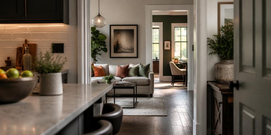
Using Architecture as a Guide
Doorways, hallways, and built-in features are not obstacles; they are opportunities. Shooting through a doorway instantly adds depth because it creates a natural frame and introduces spatial progression. You're not just photographing a room—you're showing how one space leads into another.In kitchens, countertops are particularly helpful. Positioning yourself so the counter edge runs diagonally into the frame creates a leading line that draws the eye toward the main subject. In lounges, armrests or side tables can serve the same purpose. Bedrooms often benefit from shooting slightly from the corner, allowing both walls and the bed to form intersecting planes.
These elements quietly guide the viewer's eye without announcing themselves. They're the stagehands of the composition—rarely noticed, but absolutely essential.
Choosing Angles That Add Space
Camera position matters more than any decorative cushion ever will. Shooting straight-on can work, but it often flattens the scene. A slight angle introduces depth by revealing multiple surfaces at once.Lowering the camera just a bit can also help. Not dramatically—this isn't a worm's-eye experiment—but enough to emphasize furniture planes and create separation between elements. In smaller rooms, stepping back and shooting through a doorway or from an adjacent space can make the area feel more expansive without resorting to extreme wide-angle distortion.
And yes, there is always the temptation to press yourself into the farthest corner possible. Sometimes that works. Sometimes it just makes you very familiar with the wall.
Lens Choices That Respect the Room
Wide-angle lenses are the usual go-to for interior photography, but they can be a bit overenthusiastic. Push them too far, and suddenly the room looks like it's trying to escape its own geometry. A focal length in the 16–24mm range (full-frame equivalent) is often a safe place to start, giving you enough coverage without bending reality into something unrecognizable.Moderation matters. A slightly narrower lens—around 24–35mm—can actually enhance depth because it compresses the space just enough to make layers feel connected rather than stretched apart. Lines stay straighter, furniture keeps its dignity, and the room feels believable. The goal is not to make a small room look enormous; it's to make it feel inviting and coherent.
Keeping vertical lines straight is equally important. Tilting the camera too much can make walls lean like they've had a long day. A level camera, paired with careful composition, preserves structure and reinforces the sense of depth you're trying to build.
Subtle Styling That Supports Depth
Styling doesn't need to be elaborate to be effective. In fact, the most convincing interiors often rely on restraint. A slightly pulled-out chair in the foreground can create a layer without feeling staged. A book left open on a coffee table suggests use while adding visual interest. Even something as simple as adjusting the angle of a lamp can influence how light and shadow define space.In kitchens, placing a bowl of fruit or a cutting board near the edge of a counter can anchor the foreground. In bedrooms, a folded throw at the foot of the bed introduces texture and a gentle transition between layers. These small adjustments give the eye stepping stones to follow.
- Use objects near the frame edge to create depth without cluttering the scene
- Keep pathways clear so the viewer's eye can move naturally
- Introduce slight asymmetry to avoid a rigid, staged appearance
- Let negative space exist; it enhances contrast between layers
Light as a Structural Element
Light is not just illumination; it is structure. Directional light—whether natural or artificial—creates shadows that define planes and separate layers. A window casting soft light across a sofa can distinguish it from the wall behind. A lamp illuminating a corner can pull that area forward in the composition.Avoid flattening the scene with excessive, even lighting. When everything is equally bright, nothing stands out. Allow for contrast. Let certain areas fall slightly into shadow. This variation gives the image dimension and reinforces the sense of depth you've built through composition.
Reflections can also play a role. Mirrors, glossy surfaces, and even polished countertops can extend the visual space when used carefully. When overdone, they can confuse the viewer. When controlled, they add another layer to explore.
Depth of Fieldwork
Creating depth in residential photography is less about tricks and more about awareness. Rooms already contain the elements needed—furniture, architectural lines, light, and texture. The task is to arrange them within the frame so they guide the viewer naturally from one layer to the next.When everything works together, the image feels immersive without trying too hard. The viewer doesn't analyze why it works; they simply feel like they could step inside, sit down, and stay awhile. And if the chair in the foreground happens to look especially inviting, that's not an accident—it's good composition doing its quiet job.
Article kindly provided by gdholland.co.uk
Latest Articles
- Solar Power: What Happens to Your Energy After Sunset?
- Why Your Windows Could Be Costing You More Than Your Boiler
- Choosing the Right Bit for Wood, Metal, Masonry and More
- Outdoor Furniture Survival Rules for Tropical Weather
- The Psychology of Home Heating: Why Some Houses Always Feel Cold
- Why Kitchen Cabinets Fail Long Before They Should
- Why Your Front Door Suddenly Becomes Hard to Lock
- The Psychology of Letting Go: Why It's So Hard to Clear Out a Home
- From Flat to Dimensional: Creating Depth in Residential Interior Photography
- Why Most Homes Are Over Lit - and How to Fix It Without Spending More
- Why Small Tree Problems Escalate Faster Than You Think
- How Light Changes Your Floor: Why the Same Wood Looks Completely Different in Every Room
- How to Choose a Lawn Care and Landscaping Company
- Why Sliding Doors Change How You Use a Room: Rethinking Bedroom Layouts
- Why Your Outdoor Surface Choice Matters More Than Your Furniture
- The Hidden Trade-Off Between Comfort and Grip in Outdoor Flooring
- Designing a Garden Renovation Without the Chaos
- What Your Building Is Doing Wrong With Electricity (Even If Everything Seems Fine)
- The Hidden Relationship Between Gutters and Structural Damage
- The Hidden Math Behind Healthy Lawns Getting Seed Soil and Coverage Right
- Interior Design
- Home Improvement
- Gardening
- Home Organization
- Home Maintenance
- DIY Crafts
- Kitchen and Dining
- Bathroom Design
- Home Security
- Home Automation
- Green Living
- Home Office
- Home Decor
- Garden Design
- Pet Care
- Home Technology
- Landscaping
- Home Energy Efficiency
- Home Cleaning
- Home Safety
- Home Exterior
- Home Insulation
- Home Buying
- Home Selling
- Renting
- Tradespeople
- Garage
- Bedroom
- Painting and Decorating
- Plumbing and Drainage